
This blog is part of a series on our recent agency rebrand. But let me summarise the story so far. We felt it was time to rebrand Fifty Five and Five. It was long overdue. Then we put the groundwork into figuring out our current brand positioning. With a lot of collaboration across our teams. And here we are. Step three. Agreeing a direction for the brand and putting together a visual identity. Within this, the first part of the process was to construct the right framework.
Framework
From our research and groundwork, we were able to create a framework and start the creative process for our new visual identity.
This framework set us up to design something that:
- Matched our company ambition
- Needed to feel consistent and translate complexity
- Needed to have a direct correlation between our behaviours, the story and the visual look
- Created a statement that we could always refer to keep us on track
A visual identity that reflects the ambitious, complex and dynamic nature of the company.
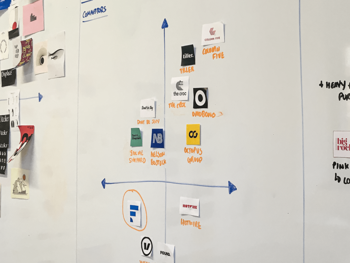
Competitor analysis
We researched our market and competitors heavily, delving deep into their brands:
- Discovering their Brand Heart's – What are these companies’ purpose, vision, mission, values?
- Understanding their Strengths & Weaknesses
- The similarities to Fifty Five and Five
- The differences to Fifty Five and Five
- Learning their business threats
- Deciphering their Value Propositions
- Breaking down their visual brand elements
Based on this competitor research we were able to place where we thought Fifty Five and Five were on a competitor axis based on our framework.
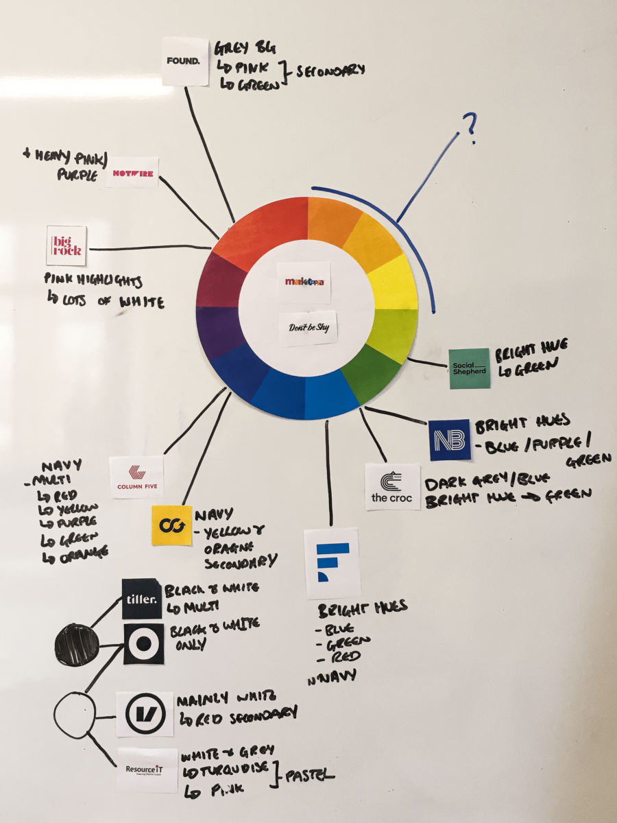
Colour wheel
Based on our competitor research, we then looked at potential opportunities we could exploit that would give us a distinctive look when matched up alongside companies that occupy a similar space. For our colour wheel above, we delved into their palettes to pull out the most prominent colours that defined them.
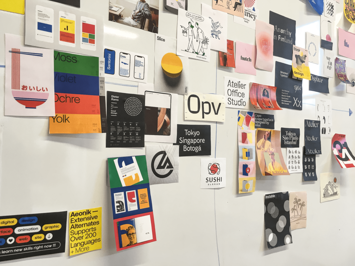
Visual inspiration
To start building a visual identity organically, we knew we needed to be open to as many different styles as possible.
By sourcing different types of creative styles (from typography and illustration to digital and print executions) and placing them on the same axis we used for our competitors, we could see the styles we thought might help us get to where we wanted to be.
Check out the next blog
In the next part in the series we look at our tone of voice and how it needed to change.