
Company Information
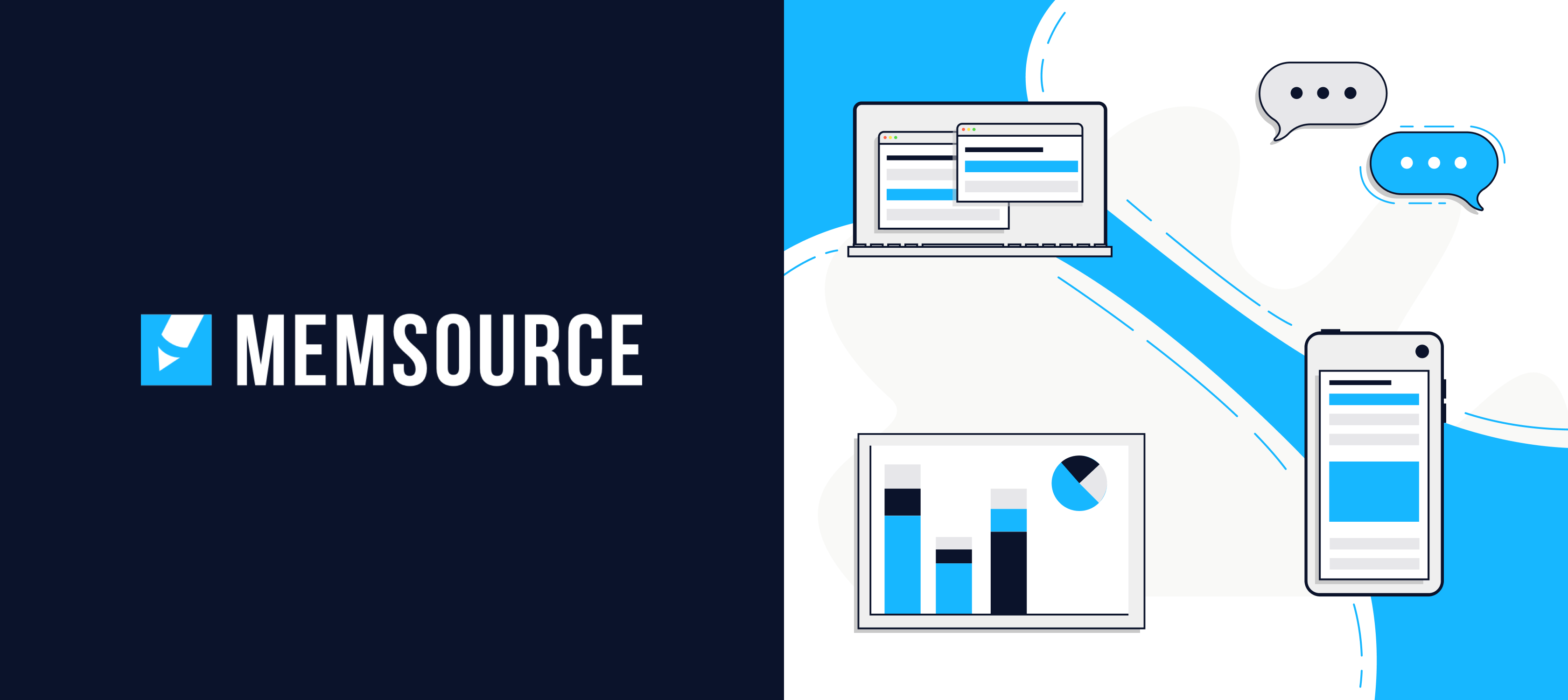
Memsource has developed a patented AI technology to help global companies translate more efficiently. It provides translation in multiple languages without high costs or inconsistent quality. With 500+ languages, Memsource serves thousands of organisations worldwide, including Uber and Zendesk.
Challenge
Memsource wanted to elevate their brand. That meant improving the direction and consistency of its visual identity, but a lack of clarity and definition in the existing brand guidelines were causing confusion.
The result was a different interpretation every time the guidelines were used and a gradual move away from a shared visual style.
On top of this, after years of growth, Memsource was looking to appeal to a different target audience. Therefore, an update was required to create a more mature brand for their new enterprise audience.
Solution
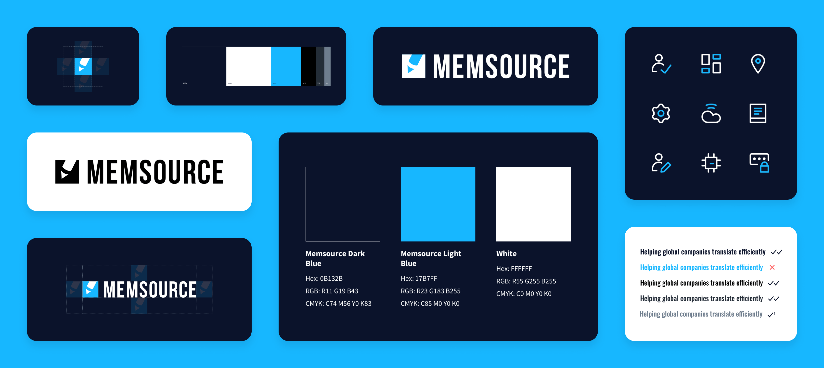
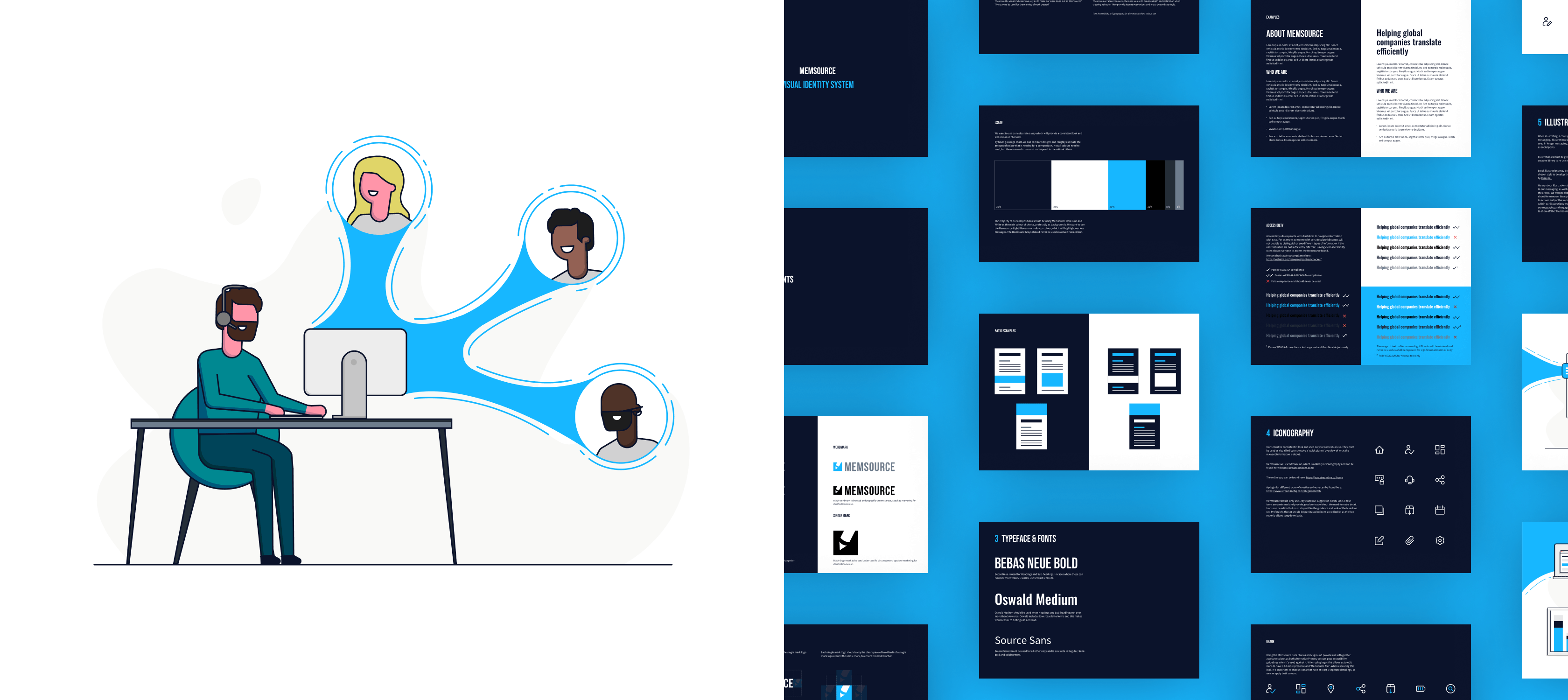
Fifty Five and Five created brand guidelines to provide greater clarity around the direction and consistency of the brand. An integral part of the existing brand was the ‘Memsource blue’ colour, which was overused and had lost its impact. We introduced colour rules, including controlling the percentage of each colour used. Now, Memsource blue is reserved for certain instances in contrast with secondary colours, allowing it to really stand out.
To appeal to an enterprise audience, we added a suitably professional polish, including a new illustration style. Within AI circles, there’s an overreliance on illustrations of robots and machinery to represent machine learning. We decided on a more abstract path, deploying the Memsource blue as the “Memsource magic” – i.e. a visual representation of the value Memsource brings to its customers.
Outcome
Memsource now has new brand guidelines that are easy to follow, easy to use, and allow for flexibility when required. What’s more, Memsource have a unique, impactful and memorable look and feel, tailored for an enterprise audience.
This has taken the Memsource brand to the next level and created a consistent visual style across channels. Accessibility rules were included, as there was also scope to improve this aspect, so now Memsource can ensure all visual elements of their brand are accessible to all.
Fifty Five and Five really took the time to understand our brand. The key was finding a way to bring together the needs of our different teams to eliminate the inconsistencies, and they really nailed this. The new guidelines have built upon the strengths of our visual identity and elevated it to the next level.
