We have launched our new brand, our new website, and a whole new way of presenting ourselves to the outside world!
At the heart of Fifty Five and Five's rebrand is our company ethos. The Fifty Five is the thought, planning and strategy we put into everything upfront. And the Five is our delivery of awesome work. Our new logo is rooted in this thinking, so is our colour scheme, the entire website design, and even the fonts we use.
This rebrand, our first since I founded the company eight years ago, is also about communicating the company we are today:
- A mature full-service agency.
- The experts our tech clients rely on.
- Ambitious for ourselves and for those we work with.
Excitingly, there are a whole bunch of cool features of our brand and website I want to share...
New Logo
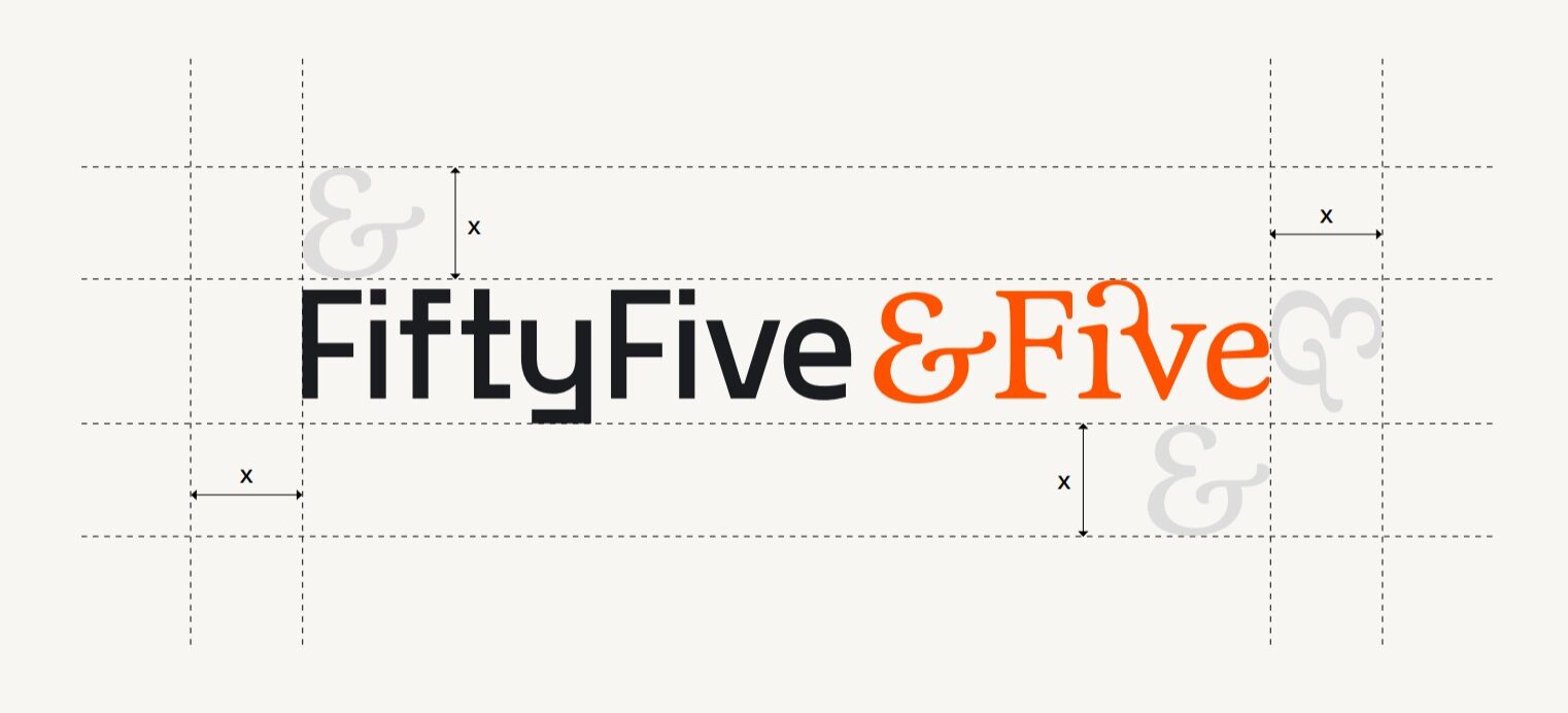
Firstly, our new logo. It is very much grounded in what the Fifty Five and the Five means. So much that the logo really visually, clearly separates out the two elements. The first half, the ‘Fifty Five’ represents the thinking and strategy side of the work model. We’ve used Gosha Sans, a rigid, angular sans serif font which lends itself to a feeling of strategy and process.
In contrast, the second half of the logo, the ‘Five’, is about the execution and the final product that get our clients excited. For this we’ve used Feijoa, combining ligature combinations, to give that feeling of finesse and flourish our work provides. Additionally, we’ve included the ampersand to balance the wordmark, while providing more visual stimulation.
Brand Mark
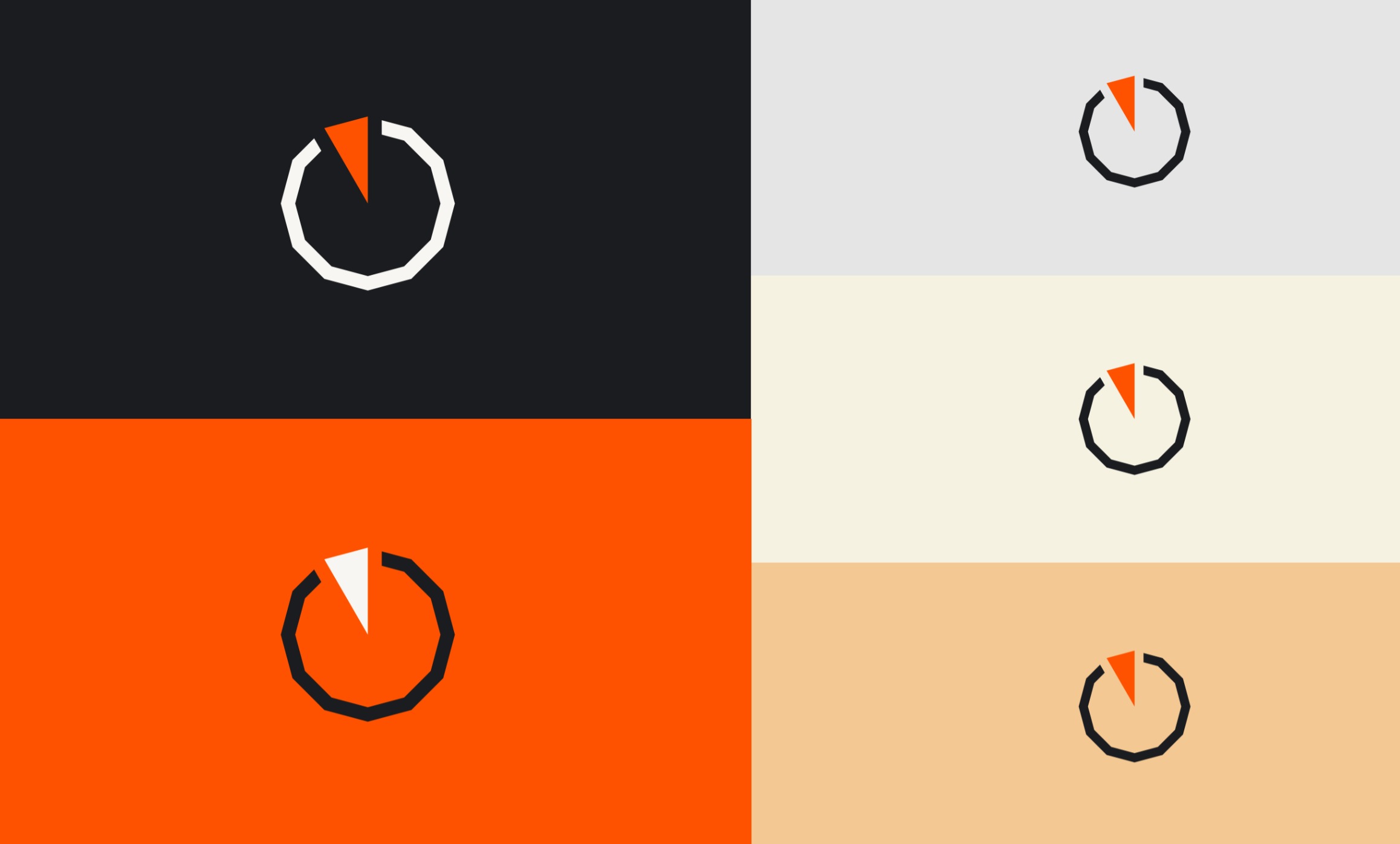
Secondly, the brand mark. It is an alternate adaptation of our story and our logo. We use this mark in instances where the primary logo is too small and becomes illegible, or in situations where the company name will appear next to a profile image, e.g. LinkedIn profile photos.
The brand mark is never used with logo.
Like our story, our brand mark is influenced by time and is based on the concept of fifty five minutes solving a problem, and five minutes executing. It’s devised to represent a minimal clockface, split into the 12 sections of a clock. The first fifty five lends itself to the process and strategy, with a mechanical and linear feel.
Conversely, the five is filled to the centre, to represent the creation part of the process. We use the idea of the 12 sections as more inspiration for our visual identity. And we use the pattern and the12 sides of the shape to adapt for different messages, adding depth for our designs.
Accessibility
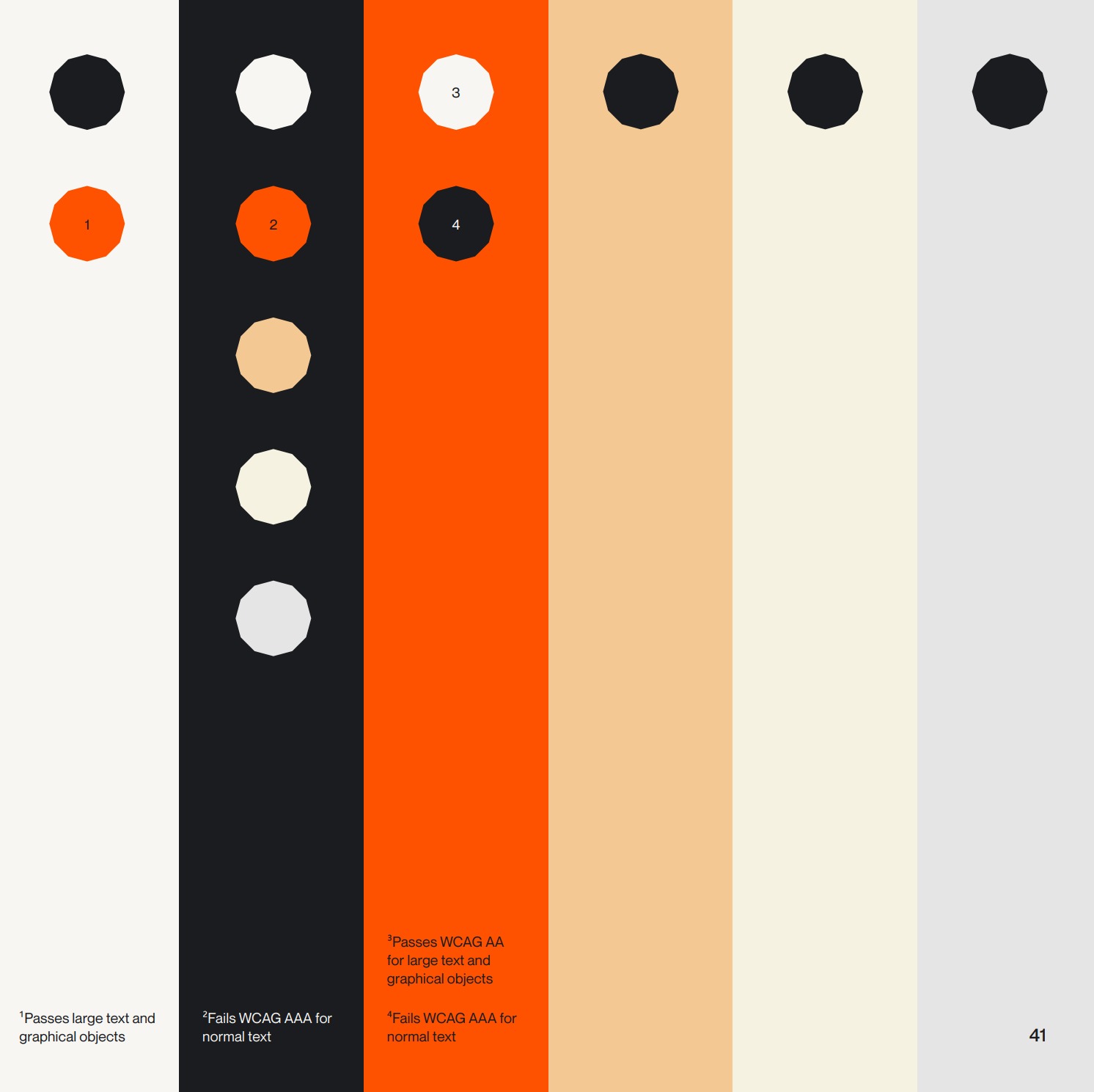
Lasylu, accessibiity. Accessibility plays a big part in the way we view information. As a marketing agency who aim to branch out to as many people as we can, it’s important that our information is as accessible as possible.
So as a general rule, all important information such as titles, body copy or CTAs, are accessible using this colour guide. Each visible colour here is accessible on the colour it sits on in some form. It’s important to read which ones need extra care.
Other items, like brand mark iterations, are used with colour combinations that aren’t accessible, depending on how important the information is. For example, if information in a diagram is important to the context of a point, it needs to be made as accessible as possible.
If you enjoyed reading about our rebrand and the changes that we made, you might enjoy reading about our thought process, the why, behind these decisions. You can read our whole rebrand journey in more detail in our blogs below:
Tell me what you think
I'd love to get your feedback on what you think of the new brand, and the new website? If you've known us over the years, or have just come across us, send me an message by hitting the button below.
